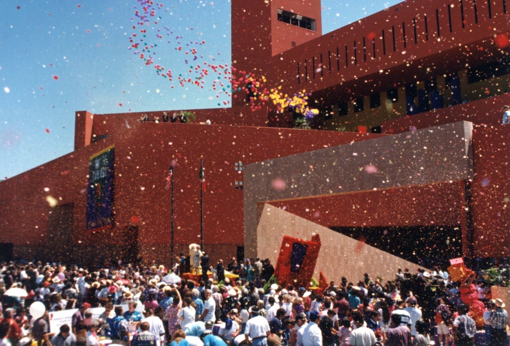
How many stories does San Antonio’s ‘enchilada-red’ public library have?

“We both wanted to do something strikingly different that had not been seen in San Antonio,” says former San Antonio Mayor Nelson Wolff about himself and the library’s board leader.

By Jack MorganFebruary 21, 2022 1:03 pm, , ,

From Texas Public Radio:

It’s only appropriate that the place with more than half a million stories contained therein has a fascinating story behind it, itself. San Antonio’s big Central Library downtown and its backstory are as quirky as its architecture.

In 1991 after several years of planning, a bond issue and site selection, there was a juried competition to determine who would build it. Three of the four entries were fairly conventional. Then there was the fourth.

“This one was totally different!” Nelson Wolff laughed.

Bexar County Judge Nelson Wolff was mayor back then and knows the library history well. He chose the late Marie Swartz to run its board, and they both had an idea about what they were looking for.

“And we both wanted to do something strikingly different that had not been seen in San Antonio,” Wolff said.

Downtown San Antonio was, more than not, limestone and brick, largely built on European traditions imported by German immigrants.
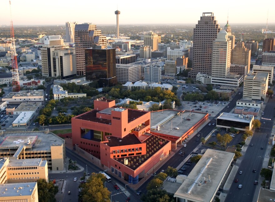
Aerial with Library Center by Clem Spalding.jpg
An aerial shot of the San Antonio Public Library/Clem Spalding

“Nothing wrong with that, but quite frankly, over the years, the city had become more and more Hispanic,” he said.

Wolff felt that reality should be reflected in new architecture. So the library board was presented with four visuals to choose from. Again, three fairly conventional ones.

“But then there was the plan by Legoretta, and it would knock your socks off,” said Nancy Gandara.

Gandara was the Assistant Director for the city’s library system back then and had a front row seat for the process. Ricardo Legoretta was the winning architect, and Gandara said she really liked the design.

“It was going to be red with yellow and purple accents. And six stories tall. With terraces, and it was just very, very striking,” she said. “And very controversial, I might say.”

a red wall with stairstep edges, a large red ball sculpture, a yellow triangular wall and a rectangular purple wall, all architectural elements of san antonio public library

Will van Overbeek/TxDOT

The local newspaper ran a contest once the brightly-colored building was complete. What to name that unusual red color?

“The Express-News garnered almost 1,000 entries, and some of them, as they said in the newspaper, were unprintable,” Gandara said.

The winning entry wasn’t unprintable, but it was tasty: Enchilada Red.

“At one time, there was a rumor that Maybelline was going to create a color lipstick called Enchilada Red, but I don’t know that it ever actually happened,” she said.

But back to that Mexican architect. That, too, is a curious story, as told by local architect Davis Sprinkle. In 1991, Sprinkle was looking to make a name for himself and his firm, Sprinkle Robey. The city call went out for entries.

“They encouraged the local architects to team with world-renowned or nationally known architects,” Sprinkle said.

That teaming would increase the quality of entries, while at the same time, encourage young firms to learn from the veterans.

Sprinkle was a fan of Legoretta’s work and took a gamble by just picking up the phone and giving him a call.

“When I called his office, they actually put him on the line,” Sprinkle said. “And so I told him about the project and he said that he loved San Antonio, and he said he would do the competition with us under one condition: he wanted us to do a design that we thought would be good for the city, and not a design that we thought would win the competition.”

From an original group of 15 firms applying, it had been pared down to four firms. Now came the hard part: the actual designing.

“We disappeared for, I guess it was about six or eight weeks. And in my case, I went down to Mexico City for a week or so and worked with Legoretta,” Sprinkle said.

That this young architect was able to spend that much time creating with Legoretta was a real privilege, according to San Antonio Report columnist Rick Casey.

“He was considered at that time the best architect in Mexico. And he was on the world stage,“ he said.

Casey has stayed at a couple of Mexican hotels that Legoretta designed, and talked about Legoretta’s choices.

“They use the bright colors. They use the water features. They open up space. They know how to deal with the sun,” Casey said. “They manage to use bright colors and combination with water to make a space feel even cooler, where you would think it would be the opposite.”

If you found the reporting above valuable, please consider making a donation here. Your gift helps pay for everything you find on texasstandard.org and Texas Public Radio. Thanks for donating today.